The Secret in the Wings
The Secret in the Wings (Seattle University Theater Program 2024)
24 x 36", 11 x 17", 8.5 x 11", 1920 x 1080 px,
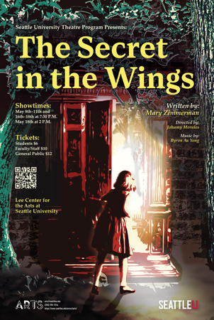
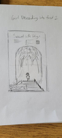
These designs were created again for the Seattle University Theater Program for their last play of the 2023-24 academic year. For this design, I created several draft images based on the initial rundown for this play. When starting this project and before drafting, I was very confused as to what this play was all about, more so than the previous theater production plays I made designs for. After trying to read some of the script and overall description with limited research I heavily relied on Johamy Morales's instruction. She helped give me a slightly clearer description of what this play was all about, but also gave me some direction into where she wanted the poster design imagery to go. She knew somewhat of what she wanted to see in terms of imagery, but it was up to me to make sense of what that would look like in terms of a design. From the information that was given to me, this play was all about finding magic in times of trouble and hardship, but I was to focus on imagery that would display the magical discovery aspect.
Although Johamy liked all of the draft images for each of their different perspectives on representing the story of the play, she really wanted me to recreate the imagery of the young girl discovering a magical forest in the basement. So, when creating my first digitized draft on Photoshop and Illustrator I wanted to bring out more of the magical feeling with a color story. My goal with the first 4 digitized drafts were to change the feeling of the portrayal of the story based on the color schemes going on.
The purplish-blue coloration with pops of yellow was my attempt to create a sense of coldness within the basement setting but discovering an exciting bright magical feeling. The teal blue paired with the pink and gold was another attempt to make a dark mysterious area be illuminated by a magical discovery, but this time with less disparaging darker colors. The copper/brown and bright teal coloration was inspired by the early appearance of the Statue of Liberty with the rustic and dated feeling. I really liked the pops of teal that contrasted from the copper appearance of everything else. Overall, that coloration was meant to feel much warmer and more open to exploration in a Disney-esque feeling. Lastly, that coloration had some inspiration from Blake Lively's Met Gala 2022 dress transformation from the copper coloration to the rusted teal transformation. The last draft, however, was the design that was picked for the poster cover design. With that coloration, I was aiming to create a childlike feeling that felt a bit nostalgic to me. The coloration of the green trees and brown background was meant to emulate the feelings I had as a child walking into some library or bookstore sections where there was a fake tree placed in the center area for kids to read around. Moreover, I wanted to bring out a feeling of these fake magical trees sprouting out of a dark and boring basement. The red was meant to boldly contrast the naturalistic coloration of the trees and background.
Overall, this project had a lot of challenges that I worked to overcome with the help from my design professor and the Seattle University theater department's assistant professor, Janet Hayatshahi. Professor Hayatshahi was pivotal in helping me make smaller changes in the design drafts while the director of the play was busy and unavailable to give much feedback. I learned a lot from this process in making good design decisions while not having a client that is very available to give feedback quickly. I am glad I was able to bring out the magic of this theater production though with the overall design.
Drafts


