Product Design: Baubles Lace Charms
Product Design: Baubles Lace Charms (2023)
3.5 x 4"
For my product design, I wanted to create lace charms that can be fitted onto shoelaces or hoodie laces. The idea is that the charms are very changeable, like giving earrings to your shoes or hoodie. The charms are supposed to be quirky and fun, giving a little more personality to the wearer. This is important to me because I’ve always liked the idea of charms on backpacks and water bottles, etc., but I’ve never seen them extensively worn on hoodies, pants, and shoes, at least not in recent years. The audience is from young children from (around 7) to young adults (35<). I wanted the older audience to reexperience some of that childhood y2k toy nostalgia while also making the brand feel refreshing enough for kids nowadays to buy.
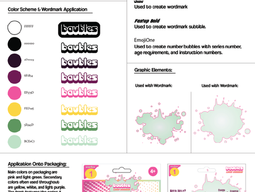
When creating my brand identity, I kept in mind that the colors should fit the product theme and that any typefaces I
choose should reflect that as well. So, when creating the wordmark, I wanted an adolescent feel to the typeface with rounded letters and little graphic elements like most kid toys have on them. Moreover, I wanted to make the colors of the wordmark colorful enough to be complimentary to each other and make it stick out. In order to do this, I decided to use a graphic element to be paired with the wordmark and accentuate the theme of the product and brand.
Some design considerations of this product, other than the color scheme and branding, were how big I was going to make the product itself and how I was going to attach it to the lace without sliding off the lace. I solved this problem by buying a bead stopper and decided to sell this with the product because they come very cheap and in bulk. Another challenge was cutting out the airplane shaped punch hole. I knew using my Cricut machine was my best shot at creating a clean cutout which is what I ended up using. Because I had to plan out where all the cuts would go without getting to perfectly align everything like on Illustrator proved to be a
challenge. So, I did a lot of tests to try and align them as best as I could before cutting the final pages of the package card. Even with this challenge, I ran out of time to correct the misalignment on the backside of the holepunch template of the design.
Overall, I’m proud of what I’ve created because I do feel that I’ve created a refreshed version of a Y2K era charm toy, but also a new product as well. I really like the color scheme and brand I’ve created too, because I can almost imagine it being sold at a store.


